I recently helped my in-laws to design and renovate their kitchen (breaking the mighty rule of never working for family). This was not a planned renovation, they had a dishwasher leak that ruined the flooring and damaged the cabinets and drywall. Believe me, one does not want to be undergoing a full kitchen reno in your mid 80’s!
Besides the challenge of keeping the timeline as short as possible, something I managed with the help of Mobelwerx and Simply Floors, and budget constraints, another factor was important, what I call “in line design”.
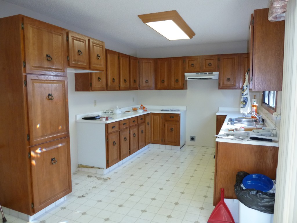
This is a 30 year old home, badly in need of an upgrade. However, that upgrade is going to have to be done by someone else when the home is sold. My in-laws are not up for spending the money, nor for the chaos and destruction, at their age.
So, while the leaky dishwasher presented an opportunity to upgrade the kitchen, the challenge was to design it to be ‘in line’ with the rest of the home. Renovating a kitchen is nearly always a worthwhile investment, but if I had over-spent on this kitchen I would have run the risk of making the rest of the house look even more dated than it already does. Balance is needed.
So, rather than utilizing custom cabinets, hardwood and granite countertops, we employed IKEA cabinets, laminate countertops and some of the new, amazing vinyl flooring from Tarkett.
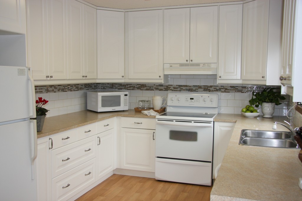
The kitchen is shiny and new, but still ties in with the oak and very brown color scheme used throughout the rest of the home. A prospective buyer will still have work to do, but will be able to walk into a new, functional and attractive kitchen and think “well, at least I don’t have to do that part”.
Here’s the laundry list of what we did and why:
- The basic layout and cabinetry configuration was kept as close to original as possible. Why? These folks are elderly. Changing the layout would have been totally confusing and disorienting. I wanted to make the change as smooth as possible. Two exceptions, I added pot drawers to one side because they are practical and easier to access than shelves and I also concealed the garbage can because I don’t like seeing the garbage when I walk into a room. There was room to do it, so I did.
- The cabinets were taken to the ceiling. Why? Because nobody wants to have to dust up there! Even if the storage space is not needed, at least it isn’t wasted space.
- The cabinets were changed to white. Why? Two reasons; if you are going to go through a reno, it’s like a makeover, you want the big change. Also, white is timeless, looks fresh and clean, and generally offends no-one, important for resale.
- The flooring was replaced but not upgraded. Why? Budget. However, I am really impressed with this hardwood lookalike from Tarkett. It creates a visual upgrade without blowing the budget.
- A new tile backsplash was added. Why? Nothing says cheap like pre-formed counter tops with integrated backsplash. The subway tile is classic. I might have chosen not to include the decor strips but they help to bring the brown back into the kitchen, while still being neutral, tying it in to the rest of the house.
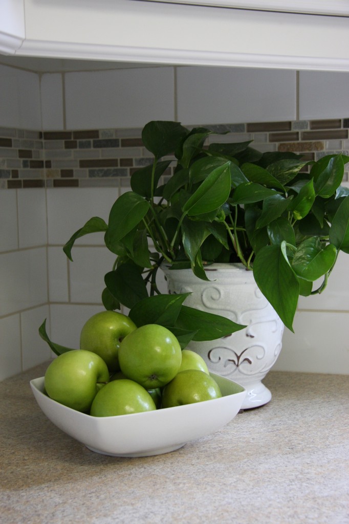
It is tempting to think that we all need to have the luxury finishes and furnishings shown in today’s home magazines, but good design doesn’t always mean spending a fortune.
Good design, like good Feng Shui, is sometimes all about balance.
DO YOU DREAM OF A HOME THAT SPEAKS TO YOUR BODY AND TO YOUR SOUL? Contact me Calgary Interior Designer

 Boost your Luck for the start of the Chinese New Year!
 A Fun Feng Shui Infographic
 Feng Shui for your Car
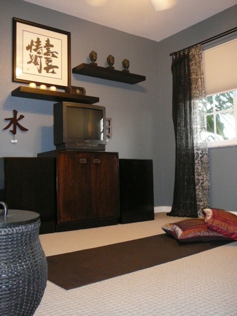 Creating Space for Yoga